Widget roles
Hey ,
I'm thrilled to help you learn JavaScript. Unfortunately, you've landed on a page where you cannot access with your current purchase.
Please upgrade (use this link) access this content.
I'm super eager to help you learn more!
Hey ,
I'm thrilled to help you learn JavaScript. Unfortunately, you've landed on a page where you cannot access with your current purchase.
Please upgrade (use this link) access this content.
I'm super eager to help you learn more!
Pay attention here. Widgets are important.
Widgets (by definition) are things a user can interact with. For example, a <button> is a widget. An <input> is also a widget.
Widgets are grouped into two categories according to the specs:
Composite roles are widget containers that contain two or more smaller widgets. Non-composite roles are the smaller widgets. There are 9 composite and 20 non-composite widget roles.
It makes more sense to group widget roles according to what they do, so I organised these 29 roles into 7 groups:
Standalone widgets are small pieces of interactive elements. They’re quite obvious. You’ll know most of them from their names.
| Role | HTML Element |
|---|---|
| button | <button> |
| link | <a href="..."> |
| separator | - |
| progressbar | - |
| scrollbar | - |
Button triggers an action when a user clicks or presses it. The <button> element has an implicit button role.
<button> This is a button </button>
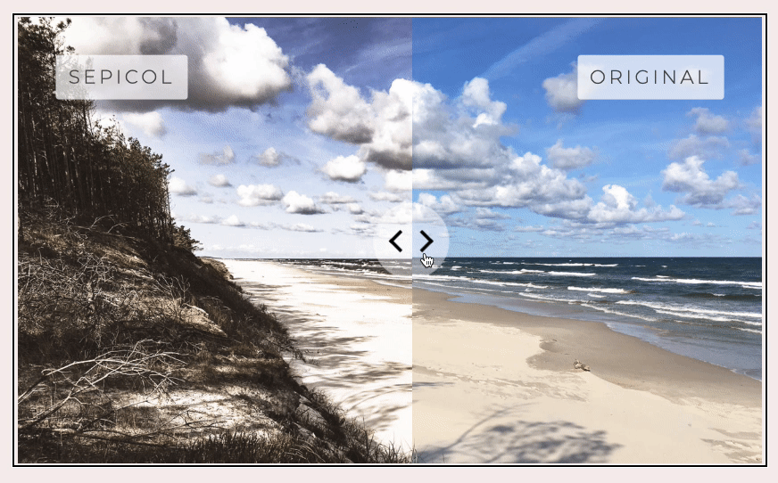
Focusable separator is a separator that divides a component into two parts. Users can slide the separator to show more or less of each part. It’s usually used for a before/after image slider.
<div role="separator" tabindex="0"> ... </div>
Link allows users to navigate to an external (or internal) resources. It’s built into an <a> with a href attribute.
<a href="#"> Link </a>
Progressbar is an element that tells the progress status for a task.
<div role="progressbar"> ... </div>
Scrollbar is, well, a scrollbar! You’ll only use this if you decide to code a scrollbar yourself.
<div role="scrollbar"> ... </div>
buttons.linksMost of these widgets are built into the <input> element.
| Role | Element |
|---|---|
| checkbox | <input type="checkbox"> |
| switch | - |
| radio | <input type="radio"> |
| textbox | <input type="text"> |
| searchbox | <input type="search"> |
| slider | <input type="range"> |
| spinbutton | - |
Checkbox is an input that can be checked by a user. Its value can be true, false, or mixed. The checkbox role is built into <input type="checkbox">
<input type="checkbox">
Switch is a type of checkbox that accepts only on or off values. (It’s like a cross-breed between a checkbox and a button). I don’t see the need to use switch when checkbox and button roles exist.
<button role="switch"> ... </button>
Radio is a checkable input that comes in a group. Only one radio can be checked at any one time. The radio role is built into <input type="radio">.
Radio elements should be contained inside a radiogroup (You only need radiogroup if you use the radio role).
<input type="radio">
Textbox is an input that allows users to enter text. The textbox role is built into <input type="text"> and <textarea>.
<input type="text">
Searchbox is a textbox that’s meant to help users search for something. The searchbox role is built into <input type="search">.
<input type="search">
Slider is an input that allows users to select a value from a given range. The slider role is built into <input type="range">
<input type="range">
Spinbutton is a type of range input that expects the user to select a value from several discrete choices. It usually comes with an Up/Down/Left/Right buttons.
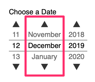
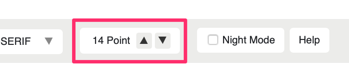
<div role="spinbutton"> ... </div>
Be familiar with <input> with these types:
textradiocheckboxsearchKnow the rest, but don’t need to remember them.
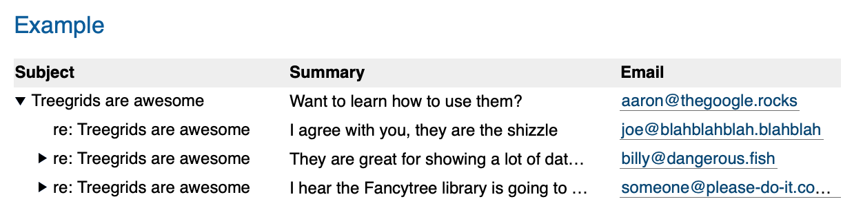
There are three composite roles in the grids and trees group. They are:
Tree is a specific type of list that contains collapsible lists.
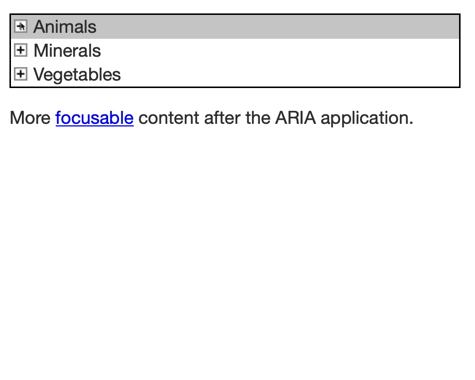
Children elements of a tree can have two roles:
grouptreeitemIf the element is an <ul> or <ol>, that element should have a group role. If the element is a <li>, that element should have a treeitem role.
<ul role="tree">
  <li role="treeitem">
    <span> Name of group </span>
    <ul role="group">
      <li role="treeitem"> ... </li>
      <li role="treeitem"> ... </li>
      <li role="treeitem"> ... </li>
    </ul>
  </li>
</ul>
Grid contains content that can be grouped into columns and rows. Grids are tables (but they don’t have to look like tables). Grids contain interactive content while tables contain static content.
Grids can use the following roles:
rowrowgrouprowheadercolumnheadergridcell<table role="grid"> <!-- table -->
<thead> <!-- rowgroup -->
<tr> <!-- row -->
<th> Column 1 </th> <!-- columnheader -->
<th> Column 2 </th>
</tr>
</thead>
<tbody> <!-- rowgroup -->
<tr> <!-- row -->
<th> Row 1 </th> <!-- rowheader -->
<td> Item </td> <!-- cell -->
</tr>
</tbody>
</table>
It’s perfectly fine if you don’t want to use the <table> element. However, you still need to make sure:
gridcell, columnheader, and rowheader are wrapped in rowrow is wrapped in rowgroup or gridTreegrid combines grid and tree. I doubt you’d ever build a component that requires a treegrid role. It looks like this:
Know these roles exist. But don’t need to remember them. You can do more research when you need to.
A listbox let users to select one or more choices from a list. Each listbox item should have the option role. options can contain images.
The best example of a listbox is the list of predictions in Typeahead.
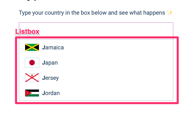
Know the listbox role exist. We won’t dive into Typeahead so we won’t use it (I’ll explain why at the end of this module).
A combobox has two elements:
<input type="text"> or <input type="search">)listboxdialoggridtreeAn example of a combobox is Typeahead.
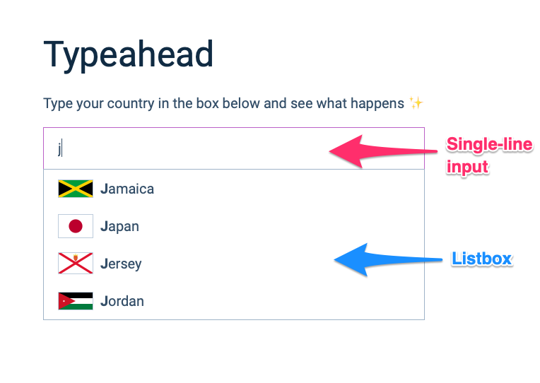
Again, know the combobox role exist. We won’t use it. (I’ll also explain why at the end of this module).
Tablist is a tabbed component. They mean the same thing.
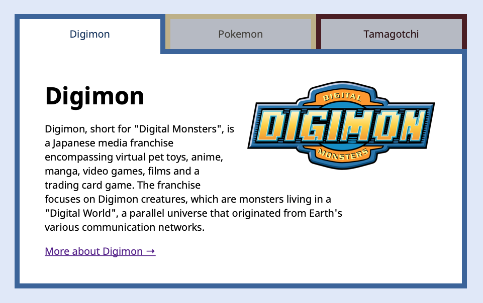
Tablist contains two kinds of children:
tab: The tabtabpanel: The content of the tab.We’ll use tab and tabpanel to improve Tabby.
There are two composite roles in the menus category:
menumenubarA menu offers a list of choices to the user. It’s similar to listbox, but it should be presented in a way that’s similar to a <select> element.
A menubar is a menu that always remains visible. It should work (and feel) the same as a menubar in most desktop applications.
Menus (and menubar) can have three types of children elements:
menuitem: A generic item inside a menumenuitemcheckbox: A checkbox inside a menumenuitemradio: A radio inside a menuKnow the menu and menubar roles exist. But also understand you should NEVER use them. (Because they put screen readers into application mode).
There are lots of widget roles. It can be confusing! I wanted to show you everything so you have a sense of role fits what kind of components.
Just know these roles exist. You don’t need to remember any of them.
We’ll go through the important ones as we improve our components together.
That’s it!